Hi, some days I’m Amy the Author, or the Mumpreneur but today I’m Amy the freelance Brand Creative. I’ve just completed one of the largest branding projects of my career (the biggest was The Royal Navy). Working in Creative Team with talented up and coming Graphic Designer Divya Venkatesh we gave agency service but cost about 90% less by working flexibly, charging reasonable rates by the hour not by the day , and with no agency overheads or exorbitant salaries to pay it meant our client got exactly what they were paying for and so much more.
The fresh new identity for The Bhavan which is a historic West London venue for Indian arts and culture, is certainly getting a lot of attention and looks sure to win over new engaged audiences and fill its members, staff and students with an even greater sense of pride. It’s already proving a big hit across social media and at the venue. It was a big step for this arts organisation to invest in creating a strong, creative and distinct brand. That’s why we’ve been working with them every step of the way to ensure the staff, the students and the members feel a real sense of ownership of The Bhavan’s creative identity.
Just imagine arriving at the venue with its vibrant new look…
 Getting a really warm welcome as you enter reception…
 Racing up the stairs to go to…
A yoga class with a guru…
Or learning a new language…
 And then spending an evening watching the best Indian dancers, actors, musicians and singers in an unforgettable show.
You’ve arrived at The Bhavan – The home of Indian arts.
But this fabulous identity didn’t just come together like that. We spent time researching what The Bhavan meant to the people who spend time there, and just who were the new audiences the arts venue should also be connecting with. I then got to work on the brand language crafting the new brand values, word banks, tone of voice, proposition and straplines.
Divya and I worked together on creating The Bhavan’s new logo which has variations for use with the strapline, website address, in colour and for different channels all explained in the client’s brand guidelines.
New typography to create consistent but distinct visual language for The Bhavan’s performance, education and corporate communications.
Two fresh colour palettes with genre brand coding for performance and education communications as well as a chic and elegant corporate identity colour palette.
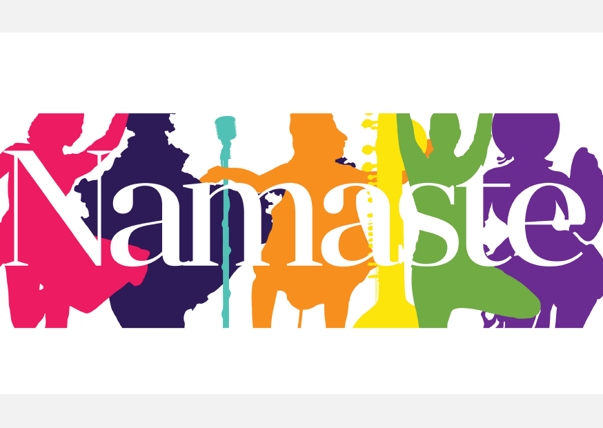
We used quotation for each genre. You can see how it all works together with the distinct genre colours and silhouettes for dance, music, language, art, vocal and yoga.
Created three graphic devices using two-tone circle, spotlight and footlights gradient, or a silhouette all of which have the flexibility to be use with high quality photography, genre colours, illustration or copy and quotation giving consistency and creativity across marketing.
![BhavanForPortfolio_PrintCollateral1[1]](https://amyibeeson.files.wordpress.com/2015/03/bhavanforportfolio_printcollateral11.jpg?w=590) We then fully tested the brand creating marketing postcards and brochures.
We then fully tested the brand creating marketing postcards and brochures.
 Which explored how to use the brand across print and digital channels.
 How to create different marketing collateral for the same show.
 Creating variation and vibrancy whilst still retaining brand consistency.
Applied the brand to social media platforms like Twitter.
 Using favicons and digital ads for use on Facebook.
Designed a new homepage where all the richness of the brand came together to create exciting content and work harder to sell.
To bring together the different elements used across the performance genres.
 To promote engagement and booking for classes.
To make navigation and interpretation fluid and give words and design space to breathe with less clutter and more purposeful content.
Identifying user pathways to maximise bookings for shows, classes and venue space.
 Creating an elegant and corporate identity to work with education or performance marketing or alone.
 With simple but chic signage for a West London street.
 Pop-ups to use at home or away.
Not forgetting T-Shirts that can be adapted for staff, teachers and student to give them greater ownership and physicality of The Bhavan brand.
The brand guidelines for this 360 degrees brand identity are 105 pages because we wanted to ensure consistency and because there are pages of application examples. The client used these immediately to market this season’s work, giving them real added value. The feedback on first contact and ever since has been overwhelmingly positive. It’s been a lot of fun and very much building on the brand identity work I did for Kali Theatre Company.
If you’d like to discuss brand, campaigns, marketing or PR please drop me a line to arranage a FREE 1 Hour Consultation. I only work with a handful of clients at a time so if the brand and marketing work we’ve done for The Bhavan has captured your imagination have a little nose around in my portfolio and Divya’s Facebook Page and connect with us @AmyIBeeson @Divyaani. We’re confident together we’d be able to create a brand and marketing campaign you and your audience will love.
 Amy Beeson is a writer and brand creative at Wordsby Communications. She is the co-author of The New Arrival: a heartwarming true story of a trainee nurse in 1970s London and Happy Baby, Happy Family: Learning to trust yourself and enjoy your baby.
Divya Venkatesh is a SW London-based graphic designer and illustrator working in the arts & culture, publishing, jewellery, digital marketing, non-profit and education sectors for individual clients and agencies.
 |
 |


![BhavanForPortfolio_1[1]](https://amyibeeson.files.wordpress.com/2015/03/bhavanforportfolio_11.jpg?w=590)


